Tuesday, December 8, 2009
Balanced Ink
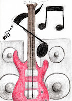
This was a study on balance. We were required to create four compositions, one with symmetrical, asymmetrical, radial balance and crystallographic.
Monday, December 7, 2009
Larger Than Life: Dream BIG, Aim small
This project was during the study of scale. We were required as a group to recreate an everyday object only MUCH bigger then the normal size. As a group we chose to do a dart because we did not have the money to spend on creating something that required more then cheap or found objects. In fact we only spent $11 on this project as many other groups would spend $50-$150. The tip of the dart is a metal spike, the gold grip part is an aquafina bottle, soup cans, texture plastic wrap and gold spray paint. The black stem of the dart is a plastic baseball bat, plastic piping and a plastic mountain dew cup all covered in black spray paint. Finally, the fins are cardboard that was spray painted red and I hand painted the logo on each side. We also build a stand for our dart board and nailed the dart into it.
What a stellar group!
What a stellar group!
Coca-Color
This project was on the study of color. We were to create 6 small compositions, each displaying a different color scheme. One of each of the following schemes were required:
Primary
Secondary
Intermediate
Monochromatic
Analogous
Complementary
Primary
Secondary
Intermediate
Monochromatic
Analogous
Complementary
Monday, November 16, 2009
Texture Project

This was a project in which we had to choose a piece of art from an artist and recreate it using a variety of textures. I choose to do David Hollenbach's painting "American Prospect." No worries this piece does not mean I hate America, haha. Hollenbach was making a statement about the American justice system. I think it has to do with slavery in the past but I'm not one hundred percent sure.
I created this piece using found objects such as: a cd, cardboard, canadian tire money, shoes laces, small rope, foam board, coffee filter, cling wrap, pencil case material, elastics, dryer sheets, piece of a towel, newspaper, sandpaper, toothpaste bottle, card stock, fudge-o packaging, epson ink cartridges and much more! We also had to have visual textures (can see but not touch, 2D) I have a couple of those to. For example, the face is drawn and not actually a texture, some of the stripes are just print outs of wood and metal textures.
(if you click on it you will be able to see the textures much better)


This is the original piece by David Hollenbach:
Friday, October 16, 2009
Shine: Value Project
This was an assignment in which we had to creatively produce a grey scale. A grey scale in every shade between black and white. The human eye can see up to approx. 44 different shades, but we can only physically reproduce (excluding computer) 12 different shades. We had to create 11.
Wednesday, October 7, 2009
Big Bad Wolf: Group Perspective
This is only one fifth of a project that we did as a group. The assignment was to create a series of five compositions in ink that had a consistent intellectual theme. Each composition had to exemplify one type of perspective. We chose to do the three little pigs. This piece has a linear perspective.
Wednesday, September 30, 2009
Now and Then
This is a project in the study of shapes. We were to create two compositions with a similar theme using card stock to cut and paste. One was to be created using only geometric shapes and the other using only curvilinear shapes. The top piece is an old car from the 70's that I choose to create with geometric shapes because cars then were very boxy. The piece on the bottom I chose to create an Audi R8 with curvilinear shapes. I created this one in curvilinear shapes because modern car today are much more rounded. I also chose the colours very carefully in order to create certain contrast. First of all the two time periods in which the cars are from create contrast alone. Also the brilliant red versus the dull grey create contrast. Even the individual pieces have contrast with the red versus white and the black and grey versus white. I chose the old car to red red because the sharp colour helps define the sharp edges in the piece. I chose greyscale for the newer car because the duller colours emphasize the curving lines. There is also the unity of each piece containing white and grey and both subject matters are cars.
I hope you've enjoyed this piece as much as I did creating it!

I hope you've enjoyed this piece as much as I did creating it!

Monday, September 7, 2009
Wednesday, September 2, 2009
The Design Process
Collection of the post below is the process in which an idea becomes visual and eventually a finished product.
Tuesday, September 1, 2009
What's this for!?
This is a portfolio for my Design Basics (VCAR 113) class. It will contain all my projects from this class that will also be in my regular blog.
enjoy!
Subscribe to:
Comments (Atom)


